PowerPoint Design

Humans are not only auditory creatures, we are also highly visual. When we’re giving a speech, we can get our message across more effectively if we use visual aids to enhance our message. Many people love to hate PowerPoint as an evil tool; the destroyer of meetings and good presentations. While this reputation has an understandable history, a good set of PowerPoint slides can greatly enhance a presentation if the slide deck is well designed.

When we start with a design, we need to consider the purpose and style of the presentation. If the presentation is to convey an idea, or to work as some sort of marketing opportunity, we want to keep the design very clean and the information concise. We’ll look a lot more at the presentation of the information, and visual effect upon our audience. If we’re not sure where to start, there is a lot of work from graphic designers available online, which we can use for ideas to make sure our presentation is impactful as it can be. On the other hand, if the purpose of our presentation is to teach an advanced scientific concept, we need to spend far more time on the informative content instead of its presentation. We would work hard on structuring the information very clearly, as a scientific audience cares more about the content, while a general audience is far more sensitive to the content’s presentation.
Once we have decided on the purpose for our visuals, we need to develop a style. Namely the backgrounds, general shapes, layouts, and fonts we are going to use the build the presentation. All of these elements should work together to appear pleasing to the eye. If this is a corporate presentation, you might not have as many options as you would like. Corporations often use slide styles for corporate branding, and give out set templates you’ll have to work with.
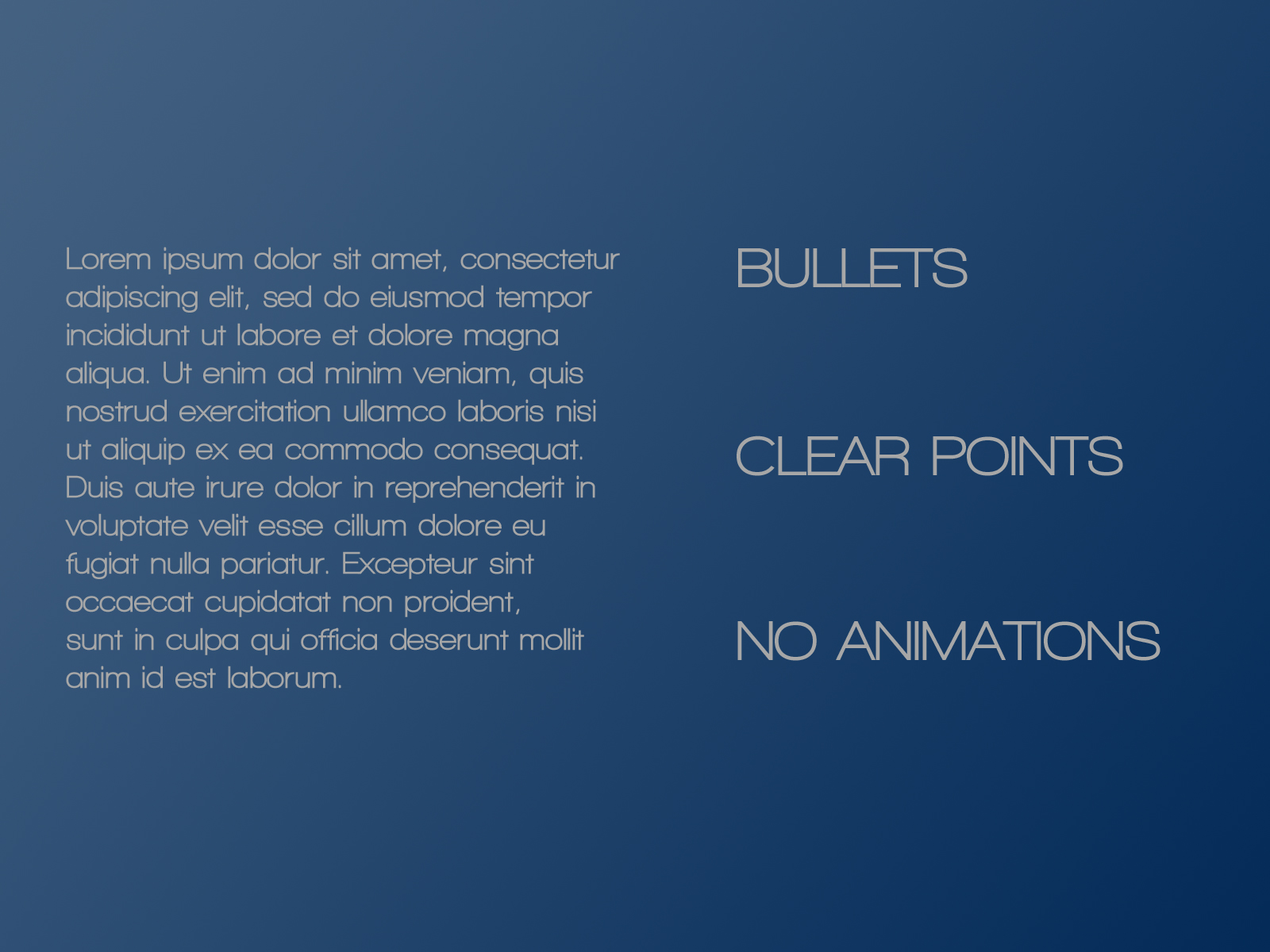
Once we have determined our styles, we can add our content. As you can see here, it’s a lot easier for people to read and understand a set of clear bullet points instead of reading the wall of text. When you expand on these points audibly, you keep your audience engaged with the details of your talk, while using your slides as an outline to follow along. Extra visual content can be used to generate further interest, or to explain details. I would stay away from animations, as they take focus away from the information you’re presenting.
Here we can also see the effects of a visual structure. In English, we read from top to bottom, left to right. By considering the horizontal positioning of these columns, we draw our eyes to the key bullet points we wish to talk about. Depending on the content, how we align things will vary, but we want to make sure the content is ordered to draw the audience to concentrate on the most important information on the slide.
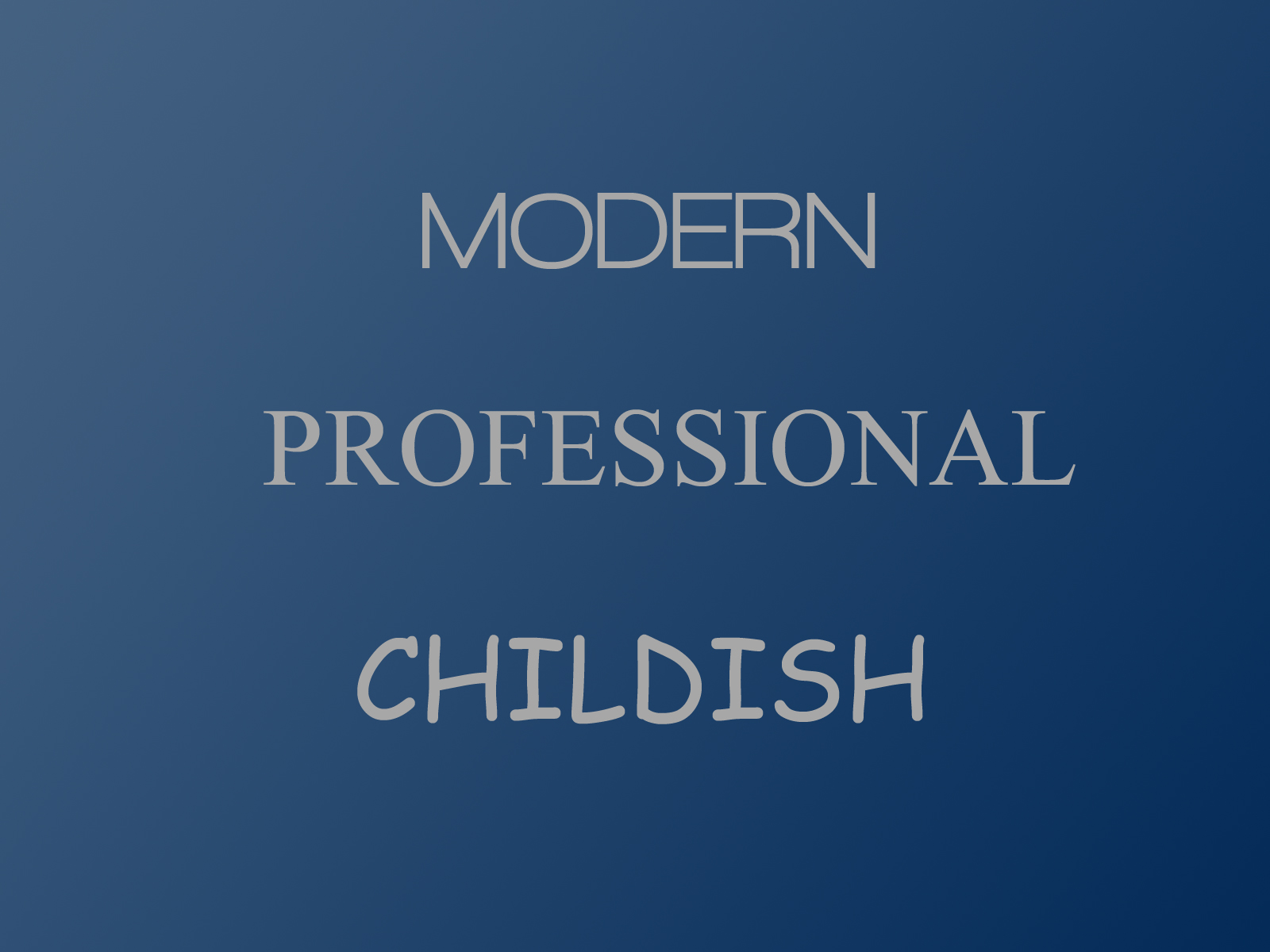
The typeface the text is written in can influence how your audience accepts the information you’re presenting. We associate visual cues with past experiences, stylistic trends, and our cultural background, and make assumptions based on those cues. For example, in New York, a green stock exchange ticker is a very positive sign, while in China, it is exactly the opposite.
Currently, san-serif fonts are seen as being more modern and stylish, while the traditional serif fonts, as the standard, go-to, conservative professional style. There are lots of very good options for these styles, so generally it’s a matter of picking one you like. Cursive fonts can be very elegant, which is more likely to be used for larger headers on marketing material instead of presentations. Many cursive fonts don’t have very good digital versions and are very sensitive to font size, so you need to much more careful on which font you select. Younger and international audiences can find these fonts more difficult to read. Finishing here with Comic Sans, there has been enough said about it already. Unless you are using it for something related to your elementary school aged children, I would avoid it.
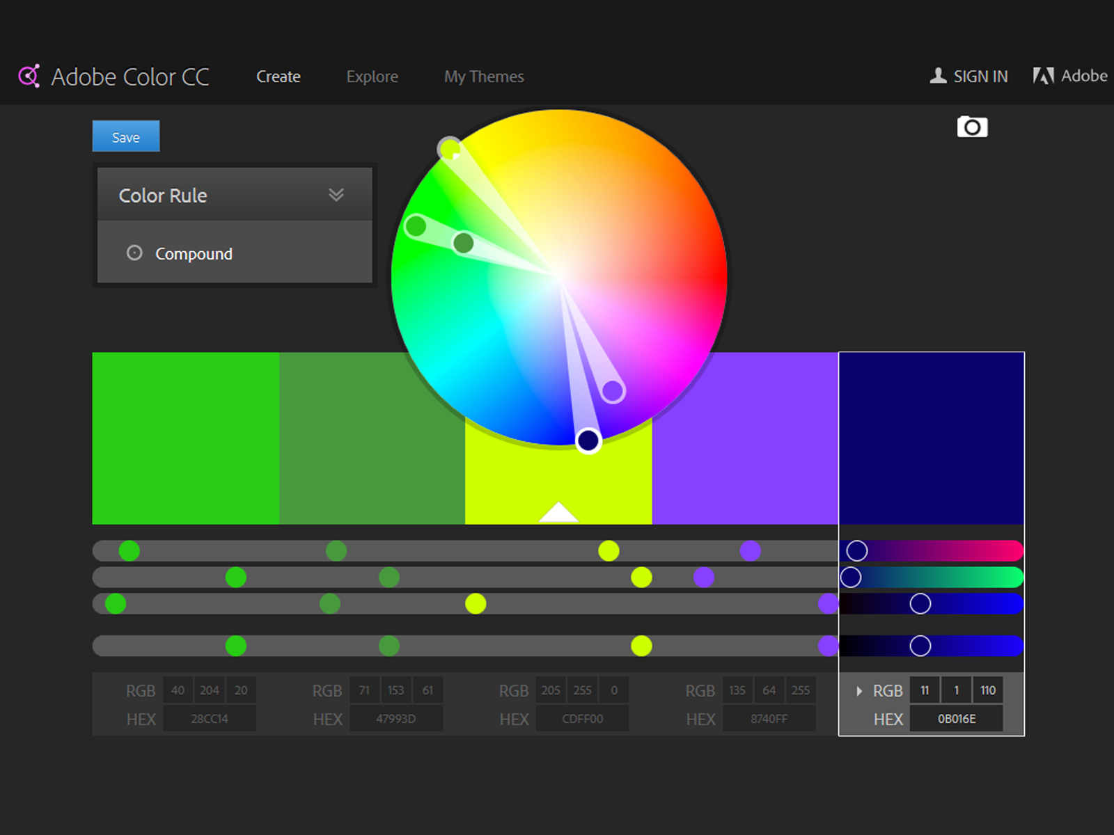
Color is a very important part of your style design as it can give your presentation an extra edge, or shoot you in the foot. If you’re not sure which colors look best together, you can use tools such as Adobe Color CC, to select or generate some good complementary or compound color sets. Then you can use these color combinations as part of your overall style, so to add emphasis on certain points or words. Working with colors can be more complex than working with fonts, though you can use it to convey themes or feelings which enhance your message in very subtle or profound ways.
If you are presenting using a projector, beware of using very subtle color shifts which are easily visible on your computer screen, as the projector will desaturate your colors and make them appear the same. Similarly, you may have to increase your font widths if you are using light text on a dark background, as the dark background will appear to bleed into your text, making the text appear smaller and harder to read.

Once we have our information, we can enhance it by using relevant pictures. In this case, we have a full visual spread which can really draw our audience into our presentation, and make a much bigger impact. As we all know, a picture is worth a thousand words, and that many words don’t fit on a slide. When you’re adding images, try and go for high quality images (available on sites like freeimages, flickr, etc…), instead of the stock clip art or default themes from Windows 95.
(Source: ProofHQ)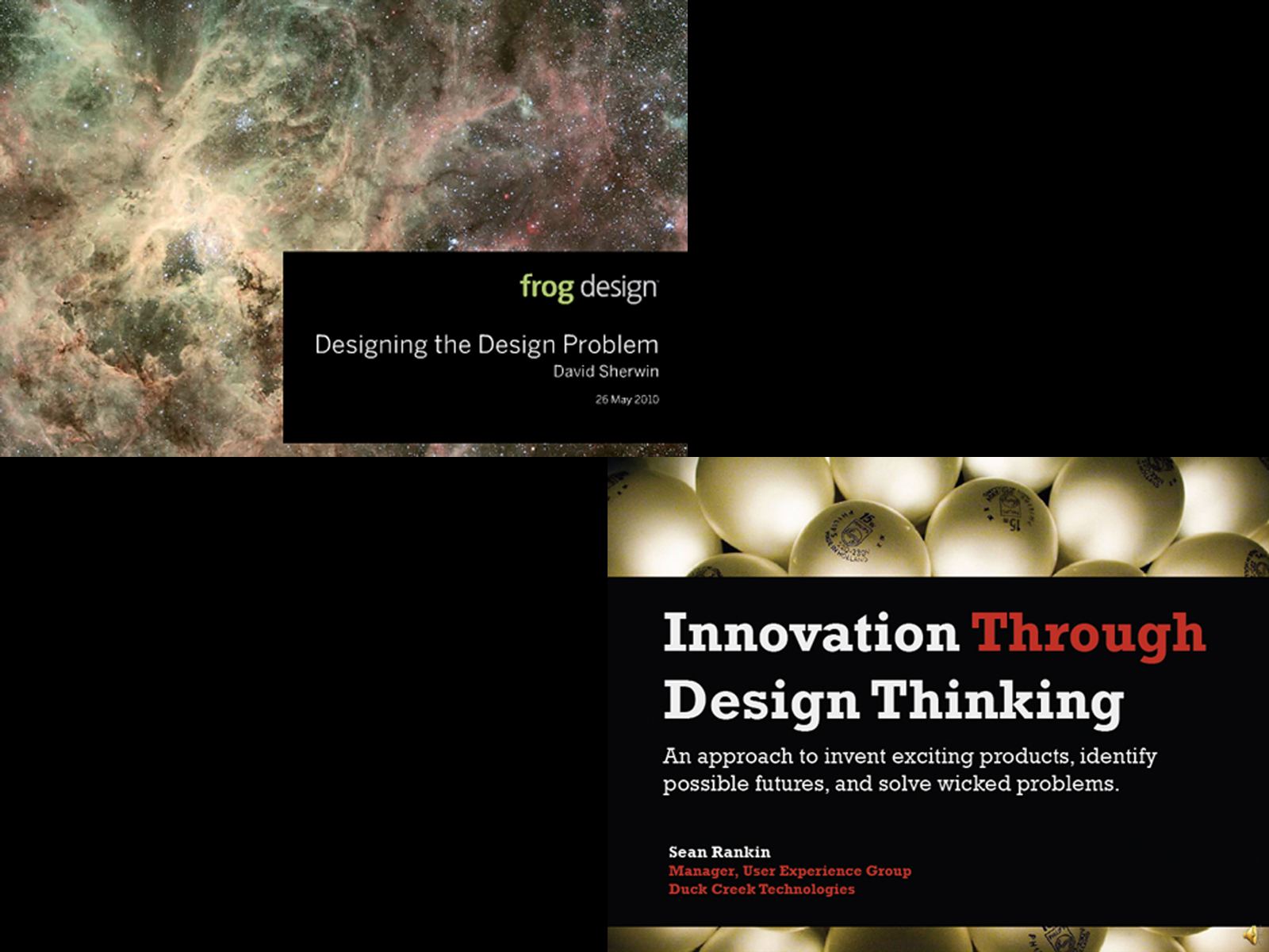
If we wish to use full visuals, we need to select images carefully, or modify the images so we can add text on top of them. Images with regions of low contrast and color variation can often have text overlaid on that part of the image. Otherwise we generally need to add an opaque box to the image on which we can write our text. Some people try and add a semi-transparent box behind their text so you can read the text while still viewing the image. Usually this only makes the image harder to see without making the text easier to read. While the full spread can sometimes generate an initial impact, sometimes it is more effective to put photos beside the text, depending on the context.

To make our presentations more effective, if we create a pleasant, clean, clear style, we create a visual medium with which to enhance our presentation. Incorporating a clear and helpful overview of our information into our visuals draws our audience in and further enhances our message. Finally, we can use images to top off our presentation. Good luck, and may your slides be ever in your favour.